Uncommon Beauty - Revlon Street Wear

My paternal Grandmother had a way of talking about someone that made you stop and wonder if she was complimenting them or insulting them. 9 times out of 10 she was insulting them. My favorite was when she called someone an uncommon beauty when she really meant they were ugly. Granny wasn't the kindest person but she always had cookies when I went to visit her. Cookies make up for a lot of negatives in my book.

I remember buying Street Wear polish when it first came out. In fact I still have two of the bottles I bought years ago. They had some amazing colors and some amazingly ugly colors. Revlon was a trailblazer with this line.

I'm showing you three that I like and that I find to be a bit more unattractive than most. There is a reason I am showing these three which I will post about next. Remember to click for a larger photo.

Taxi is a yellow that leans more toward the marigold family. It has slight golden shimmer and is the only yellow that I love and actually enjoy wearing. It takes about four coats to get it even but it's worth it.


Burnt reminds me of butterscotch pudding. It's smooth and only needs two coats. It dries with this amazing shine.


Grass Stain is a grass green with a golden/green shimmer. I love greens and this one is a favorite of mine.


Some uncommon beauty.

Essie Oscar Please - It Is Not Gold!

I picked up Essie Oscar Please for $1 in some beauty supply place. You think with the name it would be a bright gold - nope. I stared at this color and tried to come up with a written description but I was stumped. It's not yellow enough to be mustard and it has too much of a hint of gold to be putty colored. I'm going to go with pale goldenrod. It has very faint shimmer as well. This is an old school Essie and the formula was wonderful! Newer Essie polishes tend to not always play well with me.

It's not a pretty color and I like that! Go Essie! I decided to cheer it up a bit with Deborah Lippmann Happy Birthday. Still kind of ugly. Ahh. I like it. Reminds me of some weird wallpaper you would have bought in the 70's to put on your wall. And in the bathroom no less.

I always think of my 7th grade art teacher when I think of colors. He taught me color theory. He also looked like Nero Wolfe - or what I imagined Nero Wolfe looking like. I always wanted to ask him if he grew orchids.

Taken under my Ott light because it's dreary and dark at the moment. The photos are color accurate.


Nubar Jewel

So it's not as hot today. We had a bit of a storm last night and it cooled things off. This pleases me greatly. I wish it would snow though. Can you imagine how freaked people would be? Ah, the things that amuse me.

I seem to be on a holo kick. Here is Nubar Jewel. It's an unusual color choice for a holo - to my mind anyway. You usually see bright holos or metallics but this is a red based light coco color. It's different.

This is an accurate color photo. When I took some photos in the sun it became a bit lighter and less reddish. It's not as lumpy in person as it is in photos. Promise!


Here you can see it takes on a more golden hue but in person it's a bit darker and a touch redder.


China Glaze 2Nite

It's hot here in Philly. I don't like heat. At all. It get above 75F (25C) out and I get all pissy because I'm hot. I don't know how folks who live in places where it is hot all year round stand it. I bow to you and your tolerance. Or you're crazy but either way I bow to you. I however will stay in with the air conditioner and drink iced coffee.

On to the polish.

There are a few collections from China Glaze where I bought the complete collection. One of them was OMG. The whole collection needed to be mine. DV8 and OMG get a lot of love (as they should) but one of my favorites from the collection is 2Nite. It reminds me of cornflower blue and has a soft feel to it. It has a very comforting feel to me.


I love this collection so much that I took a photo of the swatch wheel because I like looking at it! Oo, pretty! Oo, shiny!

Orly Royal Navy

I love this polish! LOVE! This is going into my top 20 of 2010. I saw it at Body & Soul and had to have it. It's a vibrant royal blue with teal shimmer. Teal shimmer! It goes on smooth with two coats and it does dry a bit matte but a topcoat takes care of that. It just glows but isn't neon. The teal shimmer is really obvious too. No hiding for this one!

I thought this was limited edition but it has its own slot with the regular colors at Sally. The clerk told me it was a new permanent color and I tend to believe her because she hasn't let me down yet. But I could be wrong so run, get it!

This photo shows what it looks like indoors. Slightly deeper but still vibrant.


Outdoors where it becomes a bit more vibrant.


Isn't it pretty?

W.I.C. by Herome in Endinburgh and Konad

I got this in a swap and first thought it was nail art. It's in a slim bottle like those nail art polishes but it is actually polish. This tickled me for some reason I can't explain. It's a shimmery yellow green which is awesome! The formula was pretty good too. I have no clue about this brand beyond the two I got but I think they are neat.

Anyone have any info on this brand? I'll google but I like to hear real life information.


I decided to Konad over it with stamp M60 using a green polish from Konad and Northern Lights gold over it. It's very subtle since it is green on green but that is what I was going for.

GOSH Gasoline

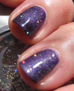
I fell in love with this color from seeing photos of it online. I was glad to get it in a swap. It's a grape purple with pink and purple shimmer. This was a bit difficult to photograph because the sparkles are more pronounced in low light as opposed to sunlight. Which is odd because usually sparkly polishes really shine in the sun. This one was shy!

Also, it was cloudy and close to raining when I took these.

This one is color accurate.


In the sun where you don't see much sparkle.


Close up so you can see the sparkle. You might want to click for a larger photo.


Under the Ott light.


I know not everyone has access to GOSH so I attempted to find/make a dupe. I thought Pure Ice Rio was a close match to the sparkle and I just needed to find a purple base that matched Gasoline. I use China Glaze Grape Pop and China Glaze Grape Juice and layered Pure Ice Rio over each one. Not a match but Grape Juice with Rio is a close match - just a bit lighter.

From left to right ChG Grape Juice with Rio, Gasoline and ChG Grape Pop with Rio.


Left to right ChG Grape Pop with Rio, Gasoline and ChG Grape Juice with Rio.


The Joys of Swapping...Ozotic 504

I love duochromes of any kind. If it has a hint of a duochrome I am all over it. Well usually. The shifting of colors keeps my attention. Plus they are just cool to wear. I have had Ozotic Pro 504 on my list for a long while. I figured I would never see it. *sniff* Thanks to Jacie at You've Got Nail I have it (and a few others) in my greedy little hands.

Isn't she pretty layered over black?


Ahh, I need a cigarette now.

American Apparel - Two Summer Colors

I purchased California Trooper and Malibu Green from American Apparel's new summer offerings because a green and a nude color are right up my alley. I think I am going to be one of the few who say this but they suck. Not the colors - those are great. The formula, oh man! It sucked so hard and so bad. It was goopey and stringy and thick and gave me bald spots. This was after adding thinner. Don't get me started on what they were like before thinner! I have a few of their colors from when they first launced and those are wonderful! Creamy and smooth with one coat. Not these.

Of course they arrived in a box with no bubble wrap. They were just thrown in there and it is only a minor miracle they weren't broken. My first order of polishes from them arrived the same way. I am thinking it wasn't the bottles that were breaking but the folks who packed them not doing a decent job.

Now colors are subjective to taste. I liked Malibu Green because it's green and I love all greens. I don't think it is unique but it's pretty. California Trooper is ugly on me and I kind of dig that but I won't reach for either because the formula SUCKS SO BAD!

Malibu Green. First photo is color accurate.


California Trooper. One photo because I couldn't stand to put it on more than three nails. It looked way worse in person. Bubbles, wrinkles and bald patches even after three coats. Blah!


Ah well, they can't all be perfect now can they?!

Some Orly

I was organizing my Helmers and pulled some Orly polishes to swatch. I really like this brand. They make some great colors and I love the rubber handle.

Orly Nouveau Satin. This dries satin and is this interesting grey/purple/silver.


Orly Satin Finesse is a gorgeous deep grape purple that has this glow. This one dries to a satin finish.


Orly Shine on Crazy Diamond over Satin Finesse. A blingy holo glitter.


Orly A La Mode Green Metallic.


Orly A La Mode Enchante.


Orly NY City Strut. Reminds me of chocolate.


Orly Plum Pudding. The glitter in this is really sparse.