Finger Paints Summer 2011: Peace, Love and Color
Labels:
Finger Paints
Groovy Green. The one I was looking forward to because it is green and Finger Paints has some really nice greens in their range. This was horrible. It was thick, lumpy and gooey even after adding 18 drops of thinner. The finish is frosty which doesn't really work with the color which is a lime green with subtle silver shimmer woven through it. 

Psychedelic Sunshine. Is a sheer yellow with tiny holographic glitter. Think a yellow tinted China Glaze Fairy Dust. It's awful. I added 43 drops of thinner but it was still thick and heavy. It dried with this weird lumpy matte finish. It also made me look like I dipped my fingers in urine and sprinkled glitter over it. I tried it over a yellow creme - still awful. I wonder what they were thinking when they made this color?


Peaceful Purple. A silvery purple glitter. Nothing exciting but again the formula leaves a lot to be desired.


Outta Sight Orange. A shimmery glass fleck orange with pink shimmer. Three coats but this has potential. It's bright and cheery and would probably work better layering it over an orange creme. The pink shimmer/flash is subtle but there but doesn't really show in the photos.


Give Pink A Chance. A vibrant coral/pink/red. This had the best formula of all of them but the color has been done many times before.


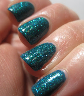
All You Need Is Color. A teal glitter with added green glitter. I like this one but, again, the formula was a bit thick and gummy.


No love for this collection. If I had to pick it would be All I Need Is Color and Outta Sight Orange but only if I was forced. The formula on most of them was just bad and they just aren't very exciting. Pity because I like Finger Paints but not this collection.
*These were sent to me for review*
13 comments
All you Need is Color is pretty but I hate polishes with bad formula
Uh oh! I picked up all of them but Give Pink a Chance (figures that would have the best application). I am now afraid to swatch them :/ I better go buy some more thinner lol
That green is horrifically bad! 18 drops!
All You Need Is Color is pretty. But since the formula is so horrible, I don't know if I'll pick up any of these.
the green reminds me of a margarita :D
It's sad the formulas are so bad because I quite like the colours.. not too unique but still pretty. Thanks for the lovely swatches!
Wow, that sucks about the formula because I think they're all beautiful! The teal is my fave.
The descirption of the first two really made me LOL. Still I think some colours are cute, although I wish the green wasn't so lime.
I'm liking the glitters - even the yellow one, which I really like over the yellow base! Send them my way! (no, just kidding, I have enough np already!)
Not the best formula and not very original colors. Summer collections just don't seem to wow me. I'm doomed to liking dark murky colors. Plus now I need another bottle of thinner!
I love All You Need is Color, but I'm afraid I wouldn't be able to stand the formula! :(
I kind of like how Psychedelic Sunshine looks. Reminds me a bit of China Glaze Sunshine which is a favourite in my stash. :D
Maybe Psychedelic Sunshine would look good sponged on to the tips of a medium purple creme or something. But ew at the formula.
Post a Comment